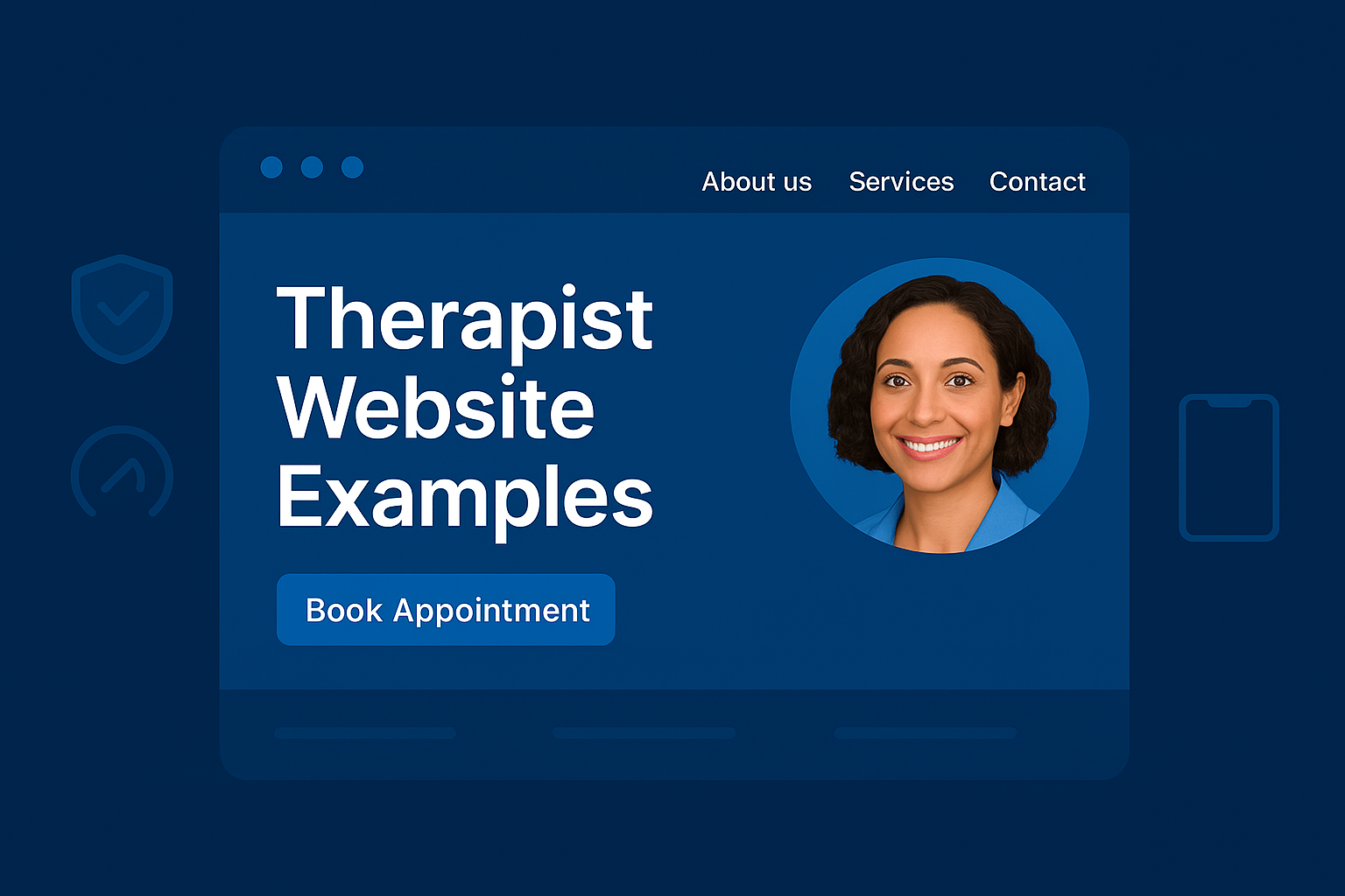
If you’re a therapist trying to grow your practice online, your website is doing one of two things: building trust quickly or losing potential clients before they ever read a word.
This guide breaks down 16 real therapist websites, each built on WordPress, organized by practice type and specialty. For each one, we go beyond design opinions and examine exactly what works: the copy approach, the layout decisions, the CTAs, and what you can directly apply to your own site.
Whether you’re a solo practitioner, group practice, neurodivergent specialist, or trauma-focused therapist, you’ll find something useful here.
What Makes a High-Quality Therapist Website?
Before the examples, here’s the short version of what separates high-converting therapy websites from ones that just look nice:
- Clarity in seconds. Visitors decide in under 5 seconds whether they’re in the right place. Your headline, hero image, and opening copy must answer: who you help, what you do, and where to start.
- Warm but direct language. Therapy is personal. Copy that sounds too clinical pushes people away; copy that sounds too casual loses credibility. The best sites find the tone that matches the therapist.
- One clear next step. Whether it’s a free consultation, a contact form, or a booking link, every page should funnel toward a single action.
- Mobile-first design. Most therapy seekers search on their phones. A site that doesn’t work seamlessly on mobile loses clients before they even read your bio.
- Service pages, not just a homepage. Each specialty you offer deserves its own page. It serves both SEO and client clarity.
- A real About page. Clients read About pages more than any other page on a therapy website. It needs to feel human, not like a CV.
With that foundation, here are therapist websites that get it right and what you can learn from each one.
Solo Therapist Website Examples
Rob Martin, LMFT — California
Website: www.robmartinlmft.com
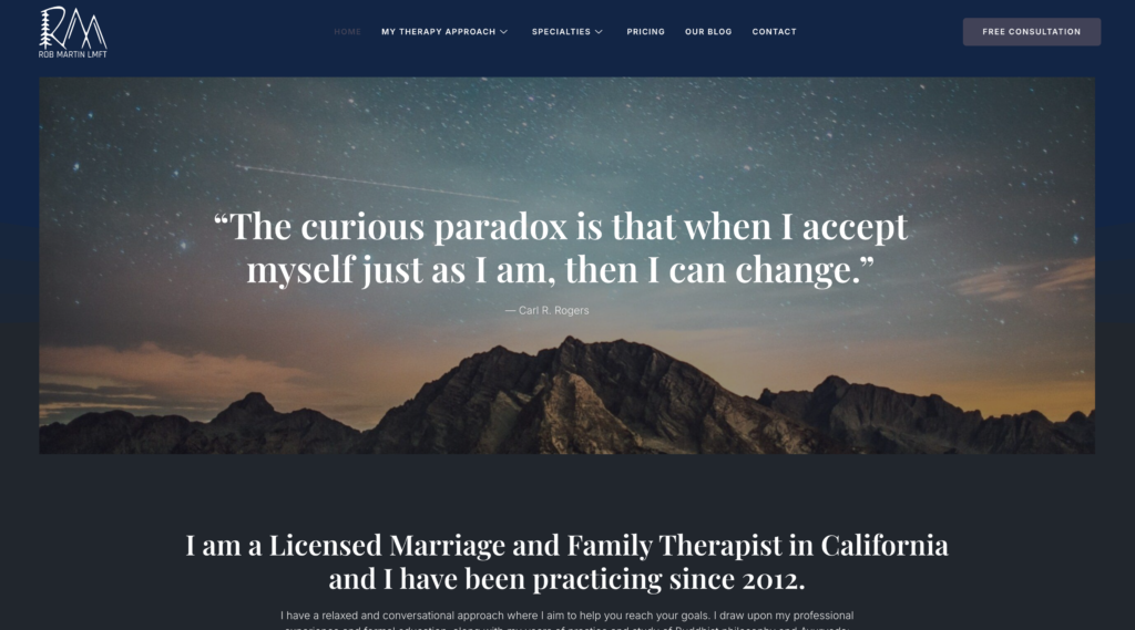
What the site does well: Rob’s site leads with plain-language explanations of his therapeutic approach, mindfulness, CBT, and attachment work written in a way clients can actually understand. No jargon. No overwhelming list of credentials front and center. The layout uses generous spacing so the page never feels crowded, and each specialty (ADHD, anxiety, depression, grief) is clearly listed with language that mirrors how clients describe their own struggles.
Specific element worth noting: The consistency between his tone and his specialties. He works with adults navigating everyday emotional complexity, and the site feels exactly like that grounded, approachable, no drama.
What to take from this: Write your service pages for your client, not for another clinician. If someone can’t explain back what you do after 30 seconds on your site, the copy needs work.
Sara Sanford Therapy — California
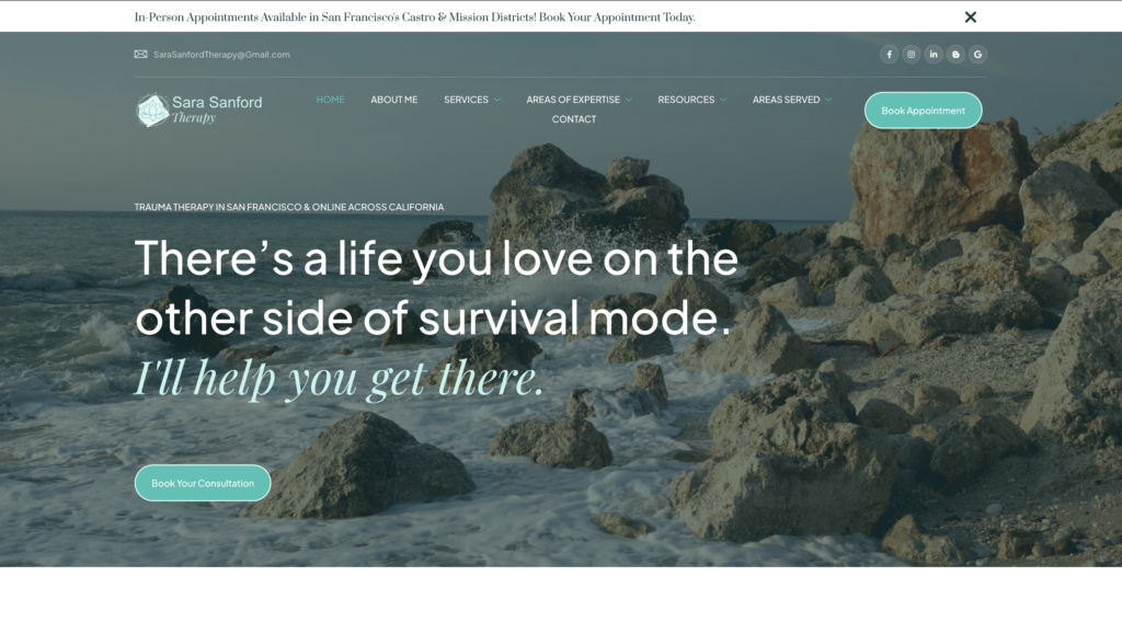
Website: www.sarasanfordtherapy.com
What the site does well: Sara’s About page is one of the strongest examples of therapist storytelling in this list. It’s reflective, personal, and grounded in lived experience. The writing doesn’t just list her credentials it communicates who she is as a clinician. Her design choices (muted tones, clean typography, generous whitespace) support the overall feeling of emotional safety that trauma survivors and couples are looking for.
Specific element worth noting: Long-form copy that still feels light. Many therapist sites go long and lose readers. Sara’s site holds attention because each paragraph earns its place.
What to take from this: Your About page is often the highest-traffic page on your site. If it reads like a resume, rewrite it like a conversation.
Suzette Bray, LMFT — California
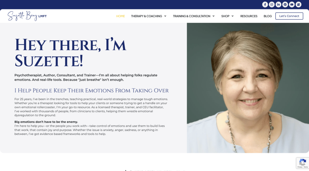
Website: www.suzettebray.com
What the site does well: Suzette positions herself not just as a therapist but as a clinical educator offering therapy, workshops, and training for other clinicians in emotional regulation. That dual positioning is communicated cleanly from the homepage. The writing is direct and practical, matching her specialty perfectly. Her site demonstrates that a niche within a niche (emotional regulation, specifically) can anchor a very strong online presence.
Specific element worth noting: Resource-building as a trust signal. Offering training and workshops establishes her as a subject-matter authority, not just a provider.
What to take from this: If you teach, consult, or train others, your website should say so prominently. It builds credibility and opens revenue streams beyond direct client work.
4. Karen K. Lowry — ADHD Coach & IEP Advocate, New Jersey
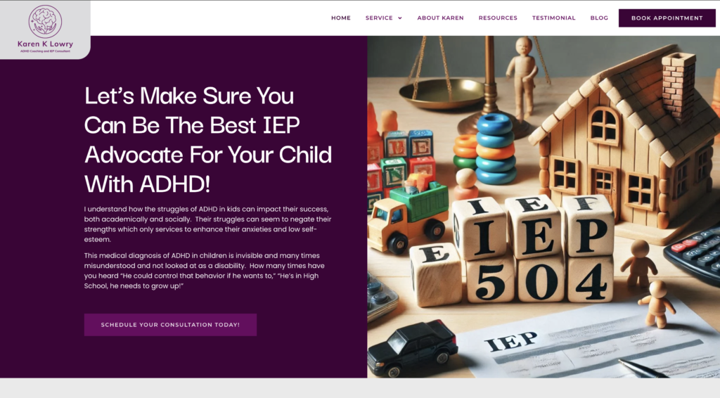
Website: www.karenklowry.com
What the site does well: Karen’s background as a pediatric ICU nurse, combined with her ADHD coaching and IEP advocacy work creates an immediately compelling credential combination. The site keeps things simple: who she helps (parents of children with ADHD and learning differences), what she offers (coaching, IEP support), and why she’s qualified. Her parent-focused language removes the guesswork for visitors.
Specific element worth noting: Prominent placement of credentials that feel relevant to the audience, not just impressive on paper. Pediatric nursing experience matters to a parent choosing an ADHD advocate.
What to take from this: Lead with the credentials that make sense to your client, not the ones that impress other professionals.
Trauma & Specialty Therapist Website Examples
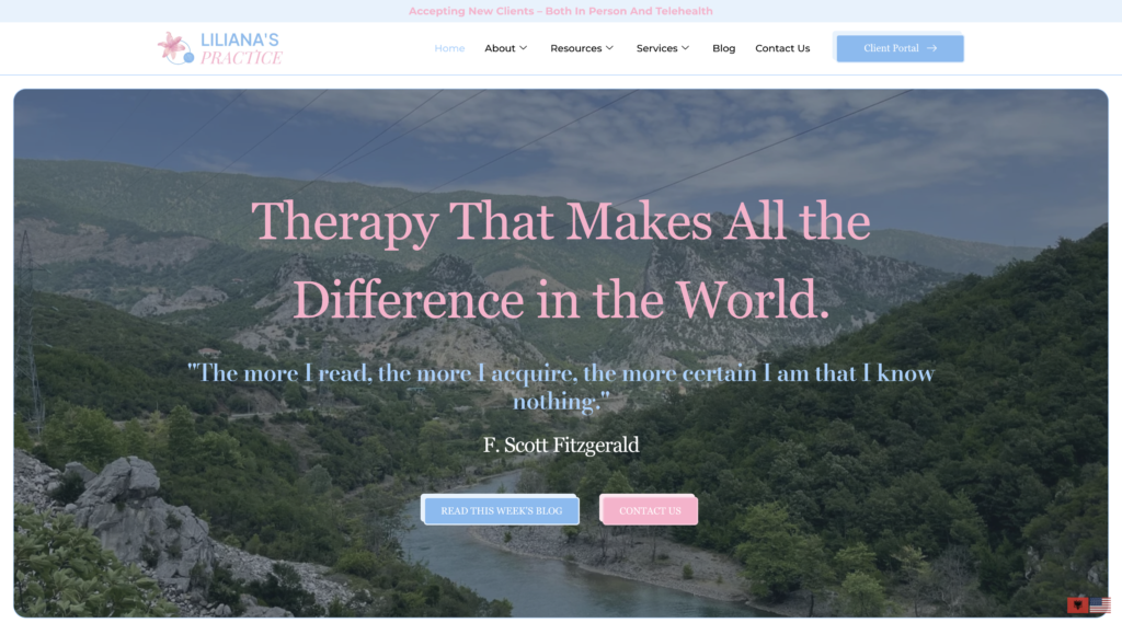
Liljana Kaci, LCSW — Liljana’s Practice
Website: www.liltherapy.com
What the site does well: Liljana’s Practice opens with a literary quote that immediately sets a tone of gentleness and depth signaling what kind of therapy this is before a visitor reads a single service description. The site prominently notes 14+ years of clinical experience, lists 10+ accepted insurance providers, and keeps navigation clean across individual therapy, EMDR, IFS, couples counseling, and group services. The banner “Accepting new clients both in person and telehealth” removes any ambiguity for a visitor who’s ready to act.
Specific element worth noting: Insurance visibility as a conversion tool. Listing accepted insurances high on the homepage removes a major barrier for clients who need to confirm affordability before reading anything else.
What to take from this: If you accept insurance, say so early and clearly. For many potential clients, that’s the first question and if your site doesn’t answer it fast, they leave.
PLACE: Parents Living After Child Estrangement — Texas
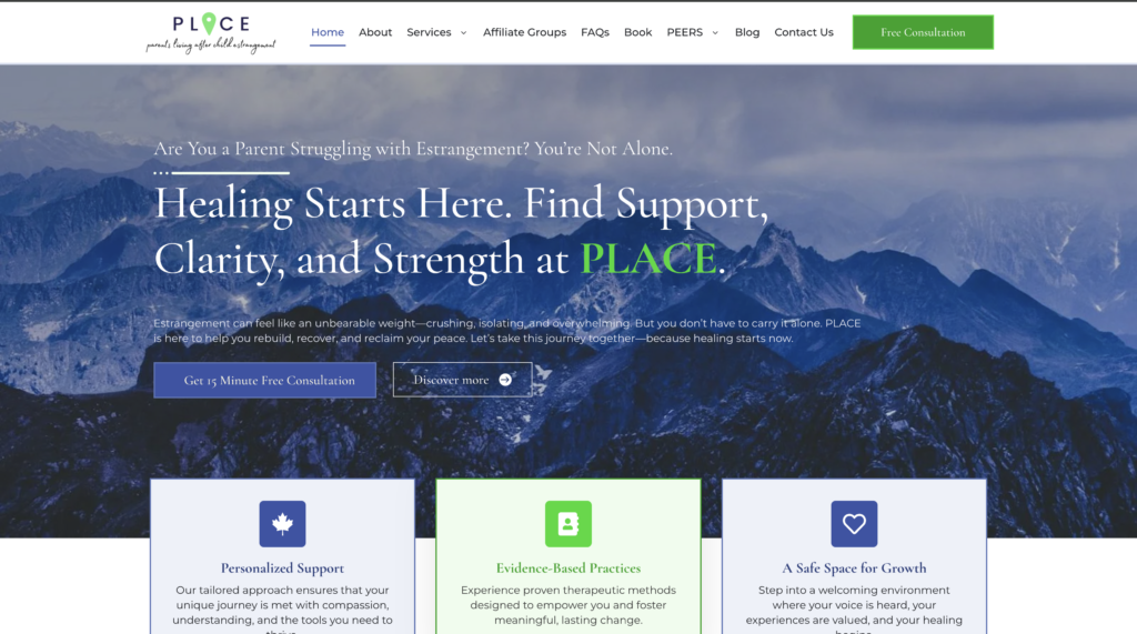
Website: www.copingplace.net
What the site does well: This is one of the clearest examples of hyper-niche positioning in mental health. PLACE speaks to one specific, painful experience of parental estrangement, and every word on the site reflects that focus. The founder’s personal story adds credibility and relatability that generalized practices can never replicate. The site blends therapy, coaching, and community support without confusing the visitor about what they’re getting.
Specific element worth noting: Niche specificity as a competitive advantage. The more specific your focus, the easier it is to rank on Google and convert visitors into clients.
What to take from this: If you specialize in a population or experience most therapists don’t serve — build your entire site around that. Specificity converts faster than generality, every time.
Blackbird Behavioral Health — Meg Wallis, Kirkland, WA
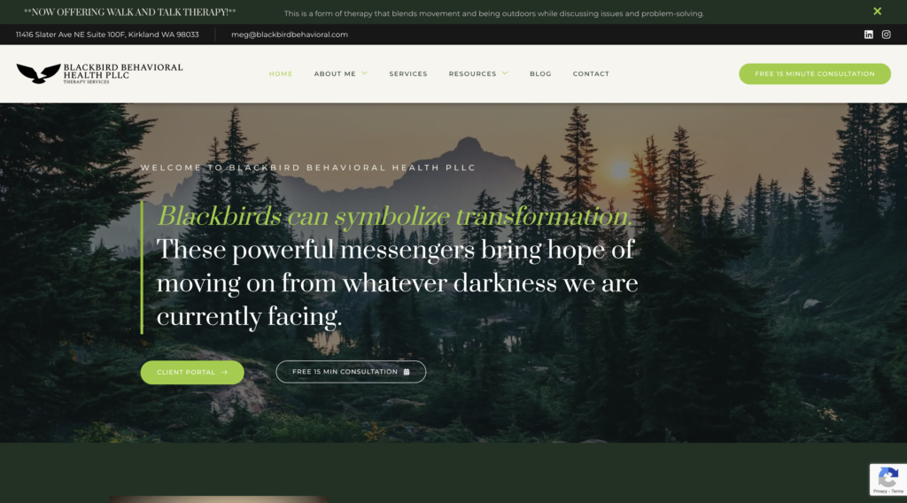
Website: www.blackbirdbehavioral.com
What the site does well: Meg’s site leads with a Leonard Cohen quote that establishes a brand identity rooted in resilience and transformation, not clinical sterility. The practice name and imagery (blackbirds as symbols of transformation) create a cohesive story across the whole site. Her newest offering, Walk and Talk Therapy, is announced with a banner at the top, signaling that this is an evolving, creative practice. The free 15-minute consultation CTA appears twice on the homepage without being pushy.
Specific element worth noting: Brand coherence. The name, the quote, the imagery, and the therapy style all point in the same direction. Visitors understand what kind of practice this is before they read the bio.
What to take from this: Your practice name and visual identity should reinforce your clinical philosophy. When they align, the site feels like a person not a business listing.
Group Practice & Multi-Clinician Website Examples
Lumen Health Services — California
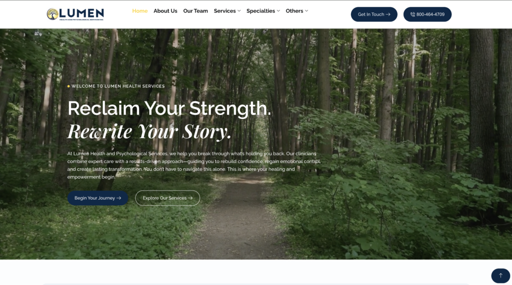
Website: www.lumenhealthservices.com
What the site does well: Lumen Health Services balances clinical confidence with approachability. Clean layouts, soft color tones, and intentional whitespace create a professional environment that still feels warm. The service structure reduces cognitive load, so visitors can quickly find what they need without being overwhelmed. Every page flows toward a clear next step.
Specific element worth noting: Visual hierarchy that guides action. The site doesn’t just look good, it’s structured so visitors naturally move from learning about services to taking the next step.
What to take from this: Simplicity in web design is a strategy, not laziness. When a site removes friction, conversions follow.
Affirm Counseling — Colorado
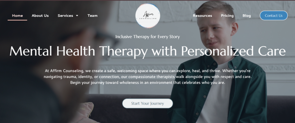
Website: www.affirmcounselingco.com
What the site does well: Affirm Counseling communicates its identity-affirming mission from the first line. Specialties EMDR, neurofeedback, and play therapy are clearly labeled, and the language throughout is inclusive, culturally aware, and trauma-informed. The color palette and layout reflect warmth without sacrificing professionalism. Visitors who need identity-affirming care will feel immediately understood.
Specific element worth noting: Values-first copywriting. Rather than leading with credentials or services, Affirm leads with who they are and who they serve. That builds trust faster for clients looking for a specific cultural or identity fit.
What to take from this: If your practice has a values-based mission, LGBTQ+ affirming, culturally responsive, trauma-informed lead with it. Clients are screening for fit before they screen for availability.
Psychological Associates of Melbourne — Florida
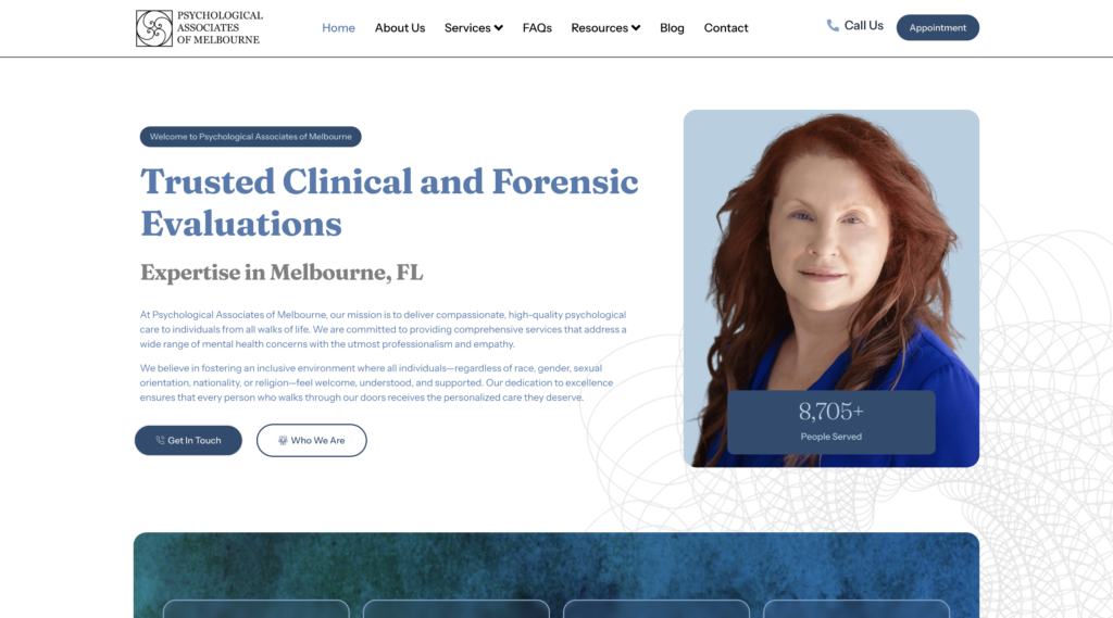
Website: www.psychmelbourne.com
What the site does well: This multi-clinician practice handles a broad range of services psychotherapy, evaluations, forensic work without the site feeling disorganized. Clean segmentation lets visitors self-select into the right service pathway. The professional visual branding communicates credibility appropriate for a practice offering both clinical and forensic services.
Specific element worth noting: Service segmentation that scales. Large practices often list everything on one page. This site creates clear lanes for different client types.
What to take from this: If you offer more than two distinct service types, your site needs clear navigation that helps each visitor find their specific path without reading everything.
P.S. It’s Counseling — Illinois & Indiana
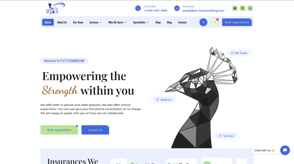
Website: www.ps-itscounseling.com
What the site does well: This practice stands apart by offering modalities you won’t find on most therapy websites Walk-and-Talk therapy, Sound Massage, Tea Therapy, Pet Therapy, and Home Visits. The site leans into this differentiation fully, with a vibrant visual identity that reflects the practice’s personality. The messaging centers on thriving, not just symptom management.
Specific element worth noting: Modality differentiation as a marketing asset. In competitive markets, offering something others don’t and building your brand around it is far more effective than competing on price or credentials alone.
What to take from this: Your unconventional offerings are a feature, not a liability. If you do something most therapists don’t, put it front and center.
Neurodivergent & Psychiatric Practice Websites
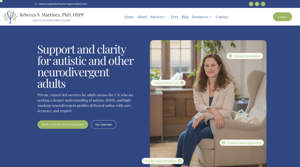
Dr. Rebecca Martinez — Adult Autism Specialist
Website: www.adultautismspecialist.com
What the site does well: Dr. Martinez’s practice fills a genuine gap: expert-led autism, ADHD, and AuDHD assessments specifically for adults a population routinely underserved in clinical settings. The site opens with a clear, direct headline: “Support and clarity for autistic and other neurodivergent adults.” No jargon. No ambiguity. The navigation includes a Self-Checks section (for autism and ADHD), which meets visitors who are still questioning whether they need an evaluation and walks them gently toward a consultation. Online scheduling and a free 20-minute consultation are both visible without scrolling.
Specific element worth noting: Self-check tools as a top-of-funnel conversion path. For a population that often questions whether their experience warrants an evaluation, offering a self-check removes a major barrier to reaching out.
What to take from this: If your specialty involves conditions where clients may doubt whether they qualify for care, give them a way to self-identify before they contact you. It closes the gap between awareness and action.
Sharmin Nabi — CortexCare Psychiatry, San Diego
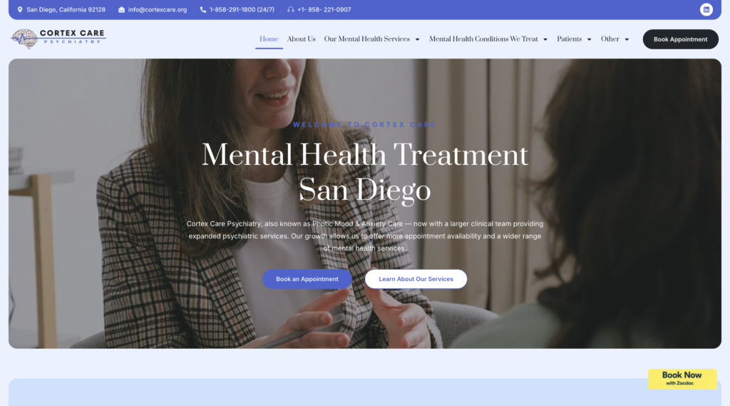
Website: www.cortexcare.org
What the site does well: CortexCare handles a wide scope of psychiatric services, evaluations, medication management, ADHD treatment, and women’s mental health without the site feeling scattered. Conditions are organized into clinical categories (mood disorders, anxiety, attention disorders, women’s health), making it easy for visitors to find their specific situation. The 24/7 phone availability is listed prominently in the header, which matters for psychiatric practices where clients may be in active distress. Zocdoc booking integration reduces friction between discovery and scheduling.
Specific element worth noting: Condition-specific pages organized by category. This structure is both user-friendly and SEO-efficient each condition page can rank independently while contributing to the overall domain authority.
What to take from this: If you treat multiple conditions, build a page for each one. Don’t list them all on a single services page. That’s leaving both client clarity and search rankings on the table.
Charity Omoregie — Mind Ease Psychotherapy
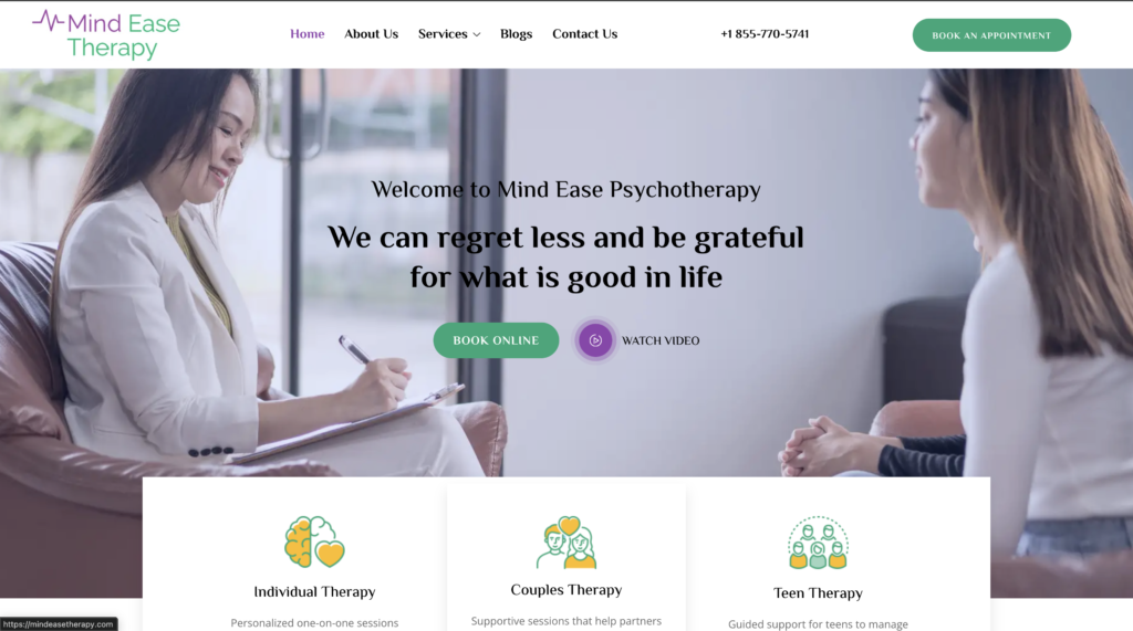
Website: www.mindeasetherapy.com
What the site does well: Mind Ease leads with culturally sensitive, inclusive care as a core value not a footnote. The site emphasizes that therapy acknowledges and respects each person’s cultural, ethnic, and personal identity. The service range is comprehensive (individual, couples, and teen therapy) while the visual design stays clean and focused. The founder’s signature appears on the homepage, adding a personal touch that larger-feeling practices often lose. With 10+ years of experience and virtual-first availability, the site communicates both credibility and accessibility.
Specific element worth noting: Cultural sensitivity positioned as a clinical value, not a marketing checkbox. For clients from communities where therapy carries stigma or cultural misalignment, seeing this stated clearly is often the deciding factor in reaching out.
What to take from this: If you offer culturally informed care, say so explicitly and early. It directly influences who feels safe enough to contact you.
Coaching & Integrative Wellness Websites
Dr. Shilpa Kapoor — Attune-In
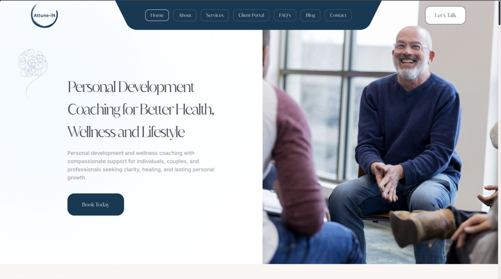
Website: www.attune-in.com
What the site does well: Attune-In sits at the intersection of therapy, coaching, and personal development a hybrid model that requires careful website architecture to avoid confusing visitors. Dr. Kapoor’s site handles this well by organizing services into two clear buckets: Intensives (couples, individual, trauma) and Coaching (lifestyle medicine, premarital support, co-parenting, business executive coaching). Each service has its own page. A client portal is accessible directly from the navigation, reducing administrative friction for existing clients.
Specific element worth noting: Intensives as a premium service tier. Offering intensive formats alongside standard coaching creates a higher-value service pathway and differentiates this practice from standard weekly-session models.
What to take from this: If your work spans coaching and clinical territory, organize services by format and intensity, not just by topic. It helps clients self-select and clearly communicates the full range of your expertise.
The Perfect Rx — Texas & Arizona
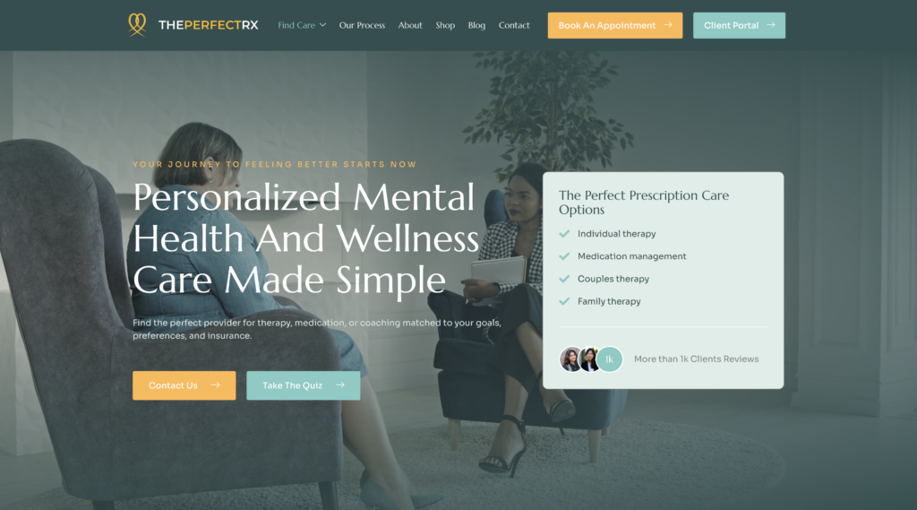
Website: www.theperfectrx.com
What the site does well: The Perfect Rx blends therapy, medication management, supplements, and coaching into one coherent digital experience. The modern design feels aligned with an integrative wellness model, and service pathways for therapy, coaching, and medication support are clearly defined. Human connection is emphasized throughout, this doesn’t feel like a clinical site despite the broad scope of services.
Specific element worth noting: One-stop mental health positioning. For clients who want to address mental health from multiple angles without coordinating multiple providers, this site communicates that clearly and seamlessly.
What to take from this: If you offer integrated care, your site’s navigation and copy must make it effortless to understand what each service does and who it’s for. Integrated doesn’t have to mean complicated.
How to Apply These Examples to Your Own Website
You don’t need to overhaul everything at once. Here are the highest-impact changes therapists make after studying strong examples:
Lead with who you help. Your homepage headline should name a person or a problem, not describe your credentials. “Therapy for adults navigating anxiety, trauma, and major life transitions” outperforms “Licensed therapist in California” every time.
Write your About page like a letter. Your training matters, but what clients actually need to know is: do you get it? Can I trust you? Will you understand my situation? Answer those questions first.
Build one page per specialty. If you specialize in EMDR, trauma, couples therapy, and ADHD, those are four separate pages. Each one can rank on its own. A single “Services” page with a paragraph on each does neither job well.
Put your CTA in three places. Top of the homepage, after your About section, and at the bottom of every service page. Make booking easy. One unclear path to contact costs you clients you’ll never know you lost.
Make insurance visible if you accept it. List your accepted insurers early. It’s often the first question a client has, and it directly affects whether they continue reading.
Choose WordPress for long-term control. Every site in this list is built on WordPress. It gives you the flexibility to grow, add service pages, run a blog for SEO, and own your platform fully without being locked into a subscription-based builder with limited customization.
Quick Checklist: Does Your Website Have These?
- A headline that names who you help or what problem you solve
- Individual pages for each specialty or service
- A personal, conversational About page
- Insurance accepted (listed prominently, if applicable)
- A single, obvious CTA on every key page
- Mobile-optimized design and fast load speed
- A regularly updated blog for SEO
- FAQ section with schema markup for better search visibility
- Google Business Profile linked and optimized
Frequently Asked Questions
u003cstrongu003eWhat should a therapist’s website include?u003c/strongu003e
A strong therapist website includes a clear homepage headline, individual service pages for each specialty, a personal About page, a contact or booking option, your insurance information (if applicable), and an FAQ section. Most practices also benefit from a blog that supports local SEO.
u003cstrongu003eHow many pages does a therapy website need?u003c/strongu003e
At minimum: Home, About, Services (with individual specialty pages), Contact, and FAQ. Practices with multiple clinicians or specialties typically benefit from 10–20 pages once specialty and location pages are included.
u003cstrongu003eWhich is the best website platform for therapists?u003c/strongu003e
WordPress is the preferred platform for therapists who want long-term flexibility, strong SEO capability, full ownership of their content, and the ability to scale. It outperforms Wix, Squarespace, and therapy-specific website builders on every SEO metric that matters for Google ranking.
u003cstrongu003eHow much does a therapist’s website cost?u003c/strongu003eu003cbru003e
A custom WordPress therapy website typically ranges from $2,500 to $6,000+, depending on scope, number of pages, and whether SEO is included. Template-based builds are cheaper upfront but often require migration later as your practice grows.
u003cstrongu003eDo therapists need a website if they’re already on Psychology Today?u003c/strongu003e
Yes. Psychology Today is a directory, not your website. You don’t own that listing, you can’t control the design or copy, and you can’t rank it on Google for your specialty keywords. A practice website is a long-term asset that a directory listing can never replace.
Why Mental Health IT Solutions Builds Therapist Websites Differently
Mental Health IT Solutions (MHIS) works exclusively with therapists, counselors, psychologists, and group practices. That specialization matters because therapy websites serve a specific psychology. Visitors are often anxious, overwhelmed, or unsure about seeking help. A site built without that understanding will look professional and still lose clients.
Every MHIS website is custom-built on WordPress, structured for SEO from day one, and designed to convert visitors into consultations. We handle everything: content strategy, copywriting, page structure, mobile optimization, speed, and user flow, so you can focus on your clients.
The 16 examples in this guide represent the range of practices we build for solo therapists, group practices, psychiatric providers, coaches, and niche specialists across the U.S. and Canada.
Conclusion
A therapy website that works feels like the right practice before a client has even read your full bio. It communicates who you help, what to expect, and how to take the first step clearly, quickly, and in a tone that matches your clinical presence.
The 16 examples in this guide demonstrate that there’s no single formula. Trauma therapists, neurodivergent specialists, integrative coaches, and group practices each solve the problem differently. What they share is intentionality; every design decision, every line of copy, and every CTA serves the person landing on that page.
If your website isn’t doing that yet, these examples show exactly where to start.
, “url”: “https://mentalhealthitsolutions.com/blog/therapist-website-examples/”, “datePublished”: “2026-01-15”, “dateModified”: “2026-05-13”, “inLanguage”: “en-US”, “author”: { “@type”: “Organization”, “name”: “Mental Health IT Solutions”, “url”: “https://mentalhealthitsolutions.com” }, “publisher”: { “@type”: “Organization”, “name”: “Mental Health IT Solutions”, “url”: “https://mentalhealthitsolutions.com”, “logo”: { “@type”: “ImageObject”, “url”: “https://mentalhealthitsolutions.com/wp-content/uploads/2025/12/10-Therapist-Website-Examples-That-Inspire-Trust-Professionalism.png” } }, “mainEntityOfPage”: { “@type”: “WebPage”, “@id”: “https://mentalhealthitsolutions.com/blog/therapist-website-examples/” }, “keywords”: [ “therapist website examples”, “therapy website design”, “therapist website WordPress”, “mental health website design”, “private practice website”, “best therapist websites 2026”, “therapist website examples 2026” ], “articleSection”: “Mental Health Marketing”, “wordCount”: “3200”, “about”: [ { “@type”: “Thing”, “name”: “Therapist Website Design” }, { “@type”: “Thing”, “name”: “Private Practice Marketing” }, { “@type”: “Thing”, “name”: “Mental Health SEO” } ] } , { “@type”: “ListItem”, “position”: 2, “name”: “Blog”, “item”: “https://mentalhealthitsolutions.com/blog/” }, { “@type”: “ListItem”, “position”: 3, “name”: “Therapist Website Examples That Build Trust & Get More Clients (2026)”, “item”: “https://mentalhealthitsolutions.com/blog/therapist-website-examples/” } ] } , { “@type”: “ListItem”, “position”: 2, “name”: “Sara Sanford Therapy — California”, “description”: “A therapy website known for its strong About page storytelling and long-form copy that holds reader attention through clean typography and emotional safety cues.”, “url”: “https://sarasanfordtherapy.com/” }, { “@type”: “ListItem”, “position”: 3, “name”: “Suzette Bray, LMFT — California”, “description”: “A dual-positioned therapist and clinical educator site focused on emotional regulation, demonstrating how niche authority builds trust and expands revenue.”, “url”: “https://www.suzettebray.com/” }, { “@type”: “ListItem”, “position”: 4, “name”: “Karen K. Lowry — ADHD Coach & IEP Advocate, New Jersey”, “description”: “A coaching site for parents of children with ADHD that leads with audience-relevant credentials including a background as a pediatric ICU nurse.”, “url”: “https://karenklowry.com/” }, { “@type”: “ListItem”, “position”: 5, “name”: “Liljana Kaci, LCSW — Liljana’s Practice”, “description”: “A trauma-informed therapy site that prominently displays 14+ years of experience, 10+ accepted insurances, and an open availability banner to remove client barriers.”, “url”: “https://liltherapy.com/” }, { “@type”: “ListItem”, “position”: 6, “name”: “PLACE: Parents Living After Child Estrangement — Texas”, “description”: “A hyper-niche mental health site serving parents experiencing child estrangement, combining therapy, coaching, and community support with a powerful founder story.”, “url”: “https://copingplace.net/” }, { “@type”: “ListItem”, “position”: 7, “name”: “Blackbird Behavioral Health — Meg Wallis, Kirkland, WA”, “description”: “A solo practice site with strong brand coherence — name, imagery, and therapy style all unified around resilience and transformation, including Walk and Talk Therapy.”, “url”: “https://www.blackbirdbehavioral.com/” }, { “@type”: “ListItem”, “position”: 8, “name”: “Lumen Health Services — California”, “description”: “A group practice website using clean layouts, soft tones, and intentional whitespace to balance clinical credibility with an approachable, conversion-friendly structure.”, “url”: “https://lumenhealthservices.com/” }, { “@type”: “ListItem”, “position”: 9, “name”: “Affirm Counseling — Colorado”, “description”: “An identity-affirming group practice site leading with values-first copywriting for LGBTQ+, culturally responsive, and trauma-informed care.”, “url”: “https://affirmcounselingco.com/” }, { “@type”: “ListItem”, “position”: 10, “name”: “Psychological Associates of Melbourne — Florida”, “description”: “A multi-clinician practice handling psychotherapy, evaluations, and forensic services with clear service segmentation that helps diverse client types self-select.”, “url”: “https://psychmelbourne.com/” }, { “@type”: “ListItem”, “position”: 11, “name”: “P.S. It’s Counseling — Illinois & Indiana”, “description”: “A group practice site built around modality differentiation — Walk-and-Talk, Sound Massage, Tea Therapy, Pet Therapy, and Home Visits — with a thriving-focused brand.”, “url”: “https://www.ps-itscounseling.com/” }, { “@type”: “ListItem”, “position”: 12, “name”: “Dr. Rebecca Martinez — Adult Autism Specialist”, “description”: “A specialist site for adult autism, ADHD, and AuDHD assessments featuring self-check tools that convert visitors who are still questioning whether they need evaluation.”, “url”: “https://adultautismspecialist.com/” }, { “@type”: “ListItem”, “position”: 13, “name”: “Sharmin Nabi — CortexCare Psychiatry, San Diego”, “description”: “A psychiatric practice site with condition pages organized by clinical category, 24/7 phone availability in the header, and Zocdoc booking integration.”, “url”: “https://cortexcare.org/” }, { “@type”: “ListItem”, “position”: 14, “name”: “Charity Omoregie — Mind Ease Psychotherapy”, “description”: “A culturally sensitive psychotherapy site offering individual, couples, and teen therapy with 10+ years of experience and virtual-first availability.”, “url”: “https://mindeasetherapy.com/” }, { “@type”: “ListItem”, “position”: 15, “name”: “Dr. Shilpa Kapoor — Attune-In”, “description”: “A hybrid coaching and therapy site organizing services into Intensives and Coaching buckets, with a client portal in the navigation for reduced administrative friction.”, “url”: “https://attune-in.com/” }, { “@type”: “ListItem”, “position”: 16, “name”: “The Perfect Rx — Texas & Arizona”, “description”: “An integrative wellness site blending therapy, medication management, supplements, and coaching into one clearly structured, human-first digital experience.”, “url”: “https://theperfectrx.com/” } ] } , “description”: “Mental Health IT Solutions is a specialized digital marketing, SEO, and website development agency working exclusively with therapists, psychologists, counselors, and mental health practices across the U.S. and Canada.”, “areaServed”: [“United States”, “Canada”], “knowsAbout”: [ “Therapist Website Design”, “Mental Health SEO”, “Private Practice Marketing”, “WordPress Development”, “Google Ads for Therapists”, “HIPAA-Conscious Digital Marketing” ], “sameAs”: [ “https://mentalhealthitsolutions.com/portfolio/” ] } , “primaryImageOfPage”: { “@type”: “ImageObject”, “url”: “https://mentalhealthitsolutions.com/wp-content/uploads/2025/12/10-Therapist-Website-Examples-That-Inspire-Trust-Professionalism.png” }, “breadcrumb”: { “@type”: “BreadcrumbList”, “itemListElement”: [ { “@type”: “ListItem”, “position”: 1, “name”: “Home”, “item”: “https://mentalhealthitsolutions.com/” }, { “@type”: “ListItem”, “position”: 2, “name”: “Blog”, “item”: “https://mentalhealthitsolutions.com/blog/” }, { “@type”: “ListItem”, “position”: 3, “name”: “Therapist Website Examples That Build Trust & Get More Clients (2026)”, “item”: “https://mentalhealthitsolutions.com/blog/therapist-website-examples/” } ] }, “publisher”: { “@id”: “https://mentalhealthitsolutions.com/#organization” } }